Sampling
Mladen Cucak; Felipe Dalla Lana; Mauricio Serrano; Paul Esker
Libraries
list.of.packages <-
  c(
    "dplyr",
    "tidyr",
    "ggplot2",
    "conflicted", #Some functions are named the same way across different packages and they can be conflicts and this package helps sorting this problem
    "here", #helps with the reproducibility across operating systems=
    "plotly", #  another advanced visualization tool
    "emdbook" #Library needed to obtain samples from a beta-binomial distribution
  )

new.packages <-
  list.of.packages[!(list.of.packages %in% installed.packages()[, "Package"])]

#Download packages that are not already present in the library
if (length(new.packages))
  install.packages(new.packages)

# Load packages
packages_load <-
  lapply(list.of.packages, require, character.only = TRUE)

#Print warning if there is a problem with installing/loading some of packages
if (any(as.numeric(packages_load) == 0)) {
  warning(paste("Package/s: ", paste(list.of.packages[packages_load != TRUE], sep = ", "), "not loaded!"))
} else {
  print("All packages were successfully loaded.")
}
## [1] "All packages were successfully loaded."rm(list.of.packages, new.packages, packages_load)
#Resolve conflicts/ if all
conflict_prefer("filter", "dplyr")
conflict_prefer("select", "dplyr")
conflict_prefer("layout", "plotly")
#if install is not working try changing repositories
#install.packages("ROCR", repos = c(CRAN="https://cran.r-project.org/"))Preliminary considerations
The sample data is collected to be used for estimating the population characteristics (ie. level of disease in the field). Since it is only a sample of that population there is an inherent uncertainty tied to these estimates. The level of uncertainty can can be controlled by collecting reliable sample size. A reliable sample size is, in this context, the one which will provide the similar answer if the sampling is to be randomly repeated.
Reliability of estimated sample mean
A coefficient of variation(CV), is a way to measure how spread out values are in a data set relative to the mean. It is calculated as:
CV = σ / μ
where: σ: The standard deviation of dataset
μ: The mean of dataset
The coefficient of variation is simply the ratio between the standard deviation and the mean.
n_plants <- 50 #  The total number of plants
infected <- 20 # Number of infected plants
(incidence  <- infected /n_plants) #  Disease incidence
## [1] 0.4(var <- (incidence* (1 - incidence))/n_plants) # Variance## [1] 0.0048(cv <- sqrt(var)/incidence) # Coefficient of variation## [1] 0.1732051cv * 100 # Often expressed in percentages## [1] 17.32051CV values in a range of around 0.1 or 0.2 (10% to 20%) are normally
considered satisfactory in for the field plant disease studies.
Reliability of estimated sample using Half-width of the required
confidence interval (normal distribution)
(1.96*sqrt(var))/incidence # H: Half-width of the required confidence interval## [1] 0.3394821.96*sqrt(var) # ## [1] 0.1357928Finite population correction
gg <-
expand.grid(
  N0 = seq(5,50, by = 5),
  M = seq(100, 4000,50 )
) %>%
  as_tibble() %>%
  mutate(N = round(N0/(1+(N0/M)),2)
         ) %>%
  arrange(N0) %>%
  ggplot(aes(M, N, group = N0,color=  N0))+
  geom_point()+
  geom_line(aes(M, N, group = N0,color=  N0))+
  geom_point(size = .4)+
  scale_color_viridis_c()+
  scale_y_continuous(name="N", limits=c(0, 50), breaks = seq(5,50, by = 5))+
  theme_bw()+
  theme(panel.grid.major.y = element_line(color = "gray",
                                          size = 0.5,
                                          linetype = 2))
gg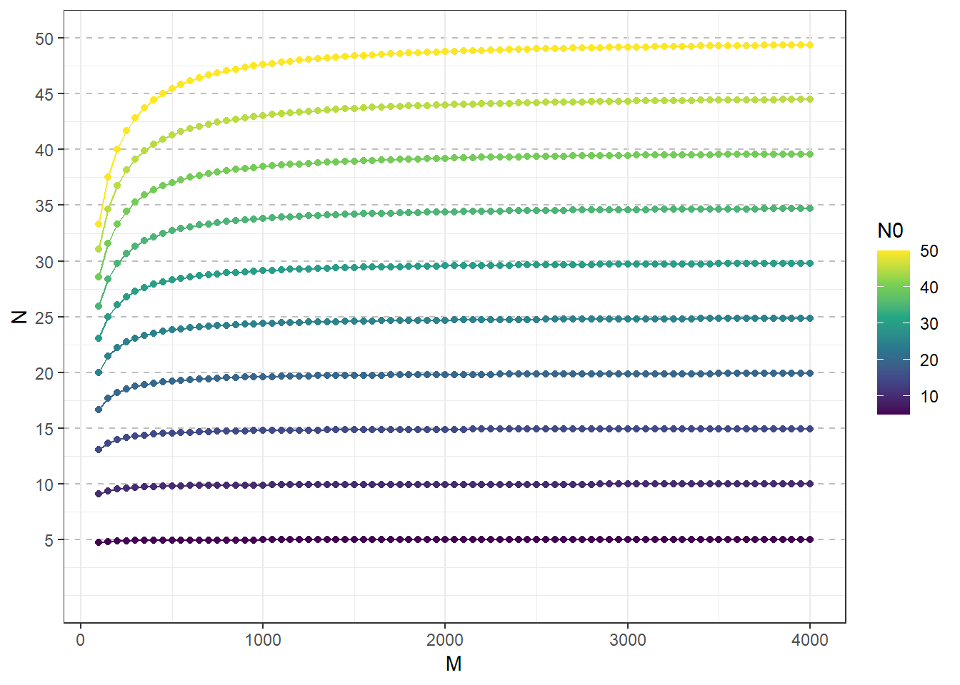
Package plotly is employed here to produce interactive
plots. Try hovering over the graph to determine the exact value of each
point. Notice the interactive features in the upper right corner.
plotly::ggplotly(gg) %>%
  plotly::layout(legend = list(orientation = "h", x = 0.4, y = -0.2))
Simple random sampling (SRS)
Simple random sampling based on binomial distribution
only with finite population correction
- M = population size
- CV = Coeficient of variation
Please note: * While each function can be used to illustrate conceptually sample size, it is important to take into account appropriate knowledge of the pathosystem of interest and conduct pilot studies or consult the literature to determine appropriate information
- Functions are written to basically calculate an initial sample that is a function of each formula - this estimate number often will be larger than the defined population size, which is the proportion of the total often may be larger than 1 (100%). Use caution for basing a sample size calculation based on the finite correction factor; may also imply the need to increase the sampling frame
EstNfcf <- function (M, mean, CV) {
  return((1 - mean) / (mean * CV ^ 2))
}
EstFcf <- function (M, mean, CV) {
  Nest <- (1 - mean) / (mean * CV ^ 2)
  finite <- Nest / M
  Nsample <- ifelse(finite > 0.1,
                    Nest / (1 + (Nest / M)),
                    Nest)
  return(round(Nsample, digits = 1))
}
NestM <- function (M, mean, CV) {
  Nest <- (1 - mean) / (mean * CV ^ 2)
  finite <- Nest / M
  return(round(finite, digits = 2))
}
gg <-
as.data.frame(expand.grid(
mean =seq(.1, .9, .1),
CV =seq(.05, .3, .01),
M = c(100, 500, 1000)
) ) %>%
mutate(
est_nfcf = EstNfcf(M,mean,CV),
est_fcf = EstFcf(M,mean,CV),
nest_m = NestM(M,mean,CV)
) %>%
#Multiplication factor(in brackets) to make the differences obvious on the plot
mutate("NEST/M(X100)" = nest_m *100,
"Estimated-FCF(X5)" = est_fcf*5,
"Estimated-NFCF" = est_nfcf) %>%
pivot_longer(cols = c("Estimated-NFCF", "Estimated-FCF(X5)", "NEST/M(X100)"),
values_to = "sample_size") %>%
ggplot(aes(CV, sample_size, group = mean, color = mean))+
geom_point(size = .5)+
geom_line()+
scale_color_viridis_c()+
facet_grid(M~name)+
theme_bw()+
theme(legend.position = "top")plotly::ggplotly(gg) %>%
plotly::layout(legend = list(orientation = "h", x = 0.4, y = -0.2))Cluster sampling for disease incidence
This code illustrates a situation in which the pattern of disease incidence at that quadrant scale is random. We will draw a sample from a binomial distribution that has the following conditions:
Number of quadrants = 300 (for our example, this would represent the population and we will use a sample as a pilot study to illustrate calculations)
Probability of success (i.e., disease) = 0.25
Number of trials per quadrant (plants) = 10
set.seed(101) enables the reproduction of the example; if desired, this can be changed to simulate different samples
set.seed(101)
field1<-rbinom(n=300, size=10, prob=0.25)
The following code illustrates creating a “field”. Mathematically, we are creating a matrix.
field1.matrix<-matrix(field1,nrow=15,ncol=20)
field1.matrix
## [,1] [,2] [,3] [,4] [,5] [,6] [,7] [,8] [,9] [,10] [,11] [,12] [,13]
## [1,] 2 4 4 2 1 4 4 3 1 3 3 2 2
## [2,] 4 2 2 1 1 1 2 2 2 1 4 3 4
## [3,] 1 2 2 1 1 1 2 0 1 1 5 0 2
## [4,] 3 1 2 4 2 4 2 2 3 3 6 1 4
## [5,] 2 3 3 3 3 2 1 3 3 2 5 2 1
## [6,] 2 1 2 3 8 5 5 2 4 1 2 5 3
## [7,] 4 0 3 3 2 4 4 2 3 3 4 1 1
## [8,] 1 2 2 1 3 3 4 4 3 0 3 3 3
## [9,] 4 1 2 3 1 2 3 5 3 4 1 3 7
## [10,] 2 4 3 4 4 1 2 3 3 2 2 2 3
## [11,] 3 3 0 2 2 2 4 4 2 1 0 1 2
## [12,] 2 1 2 3 2 2 1 4 1 2 1 3 3
## [13,] 3 1 4 3 1 4 2 3 2 2 3 4 4
## [14,] 2 2 2 5 3 2 3 2 4 2 0 4 3
## [15,] 2 3 3 1 5 2 1 3 3 3 2 3 0
## [,14] [,15] [,16] [,17] [,18] [,19] [,20]
## [1,] 2 1 5 1 3 1 1
## [2,] 3 2 3 2 1 4 6
## [3,] 4 2 4 1 0 7 1
## [4,] 4 4 2 3 1 6 1
## [5,] 1 0 2 4 4 4 4
## [6,] 3 2 0 1 1 2 2
## [7,] 1 2 1 2 1 1 1
## [8,] 5 3 4 2 3 4 2
## [9,] 3 1 5 0 1 4 2
## [10,] 2 4 3 4 4 3 1
## [11,] 0 2 3 6 2 6 2
## [12,] 3 1 5 2 4 3 2
## [13,] 3 3 3 2 4 3 5
## [14,] 1 2 4 2 3 2 3
## [15,] 2 2 2 3 4 5 1map1_long <-
reshape2::melt(field1.matrix, varnames = c("rows", "cols"))
# See first rows onf melted matrix
head(map1_long)## rows cols value
## 1 1 1 2
## 2 2 1 4
## 3 3 1 1
## 4 4 1 3
## 5 5 1 2
## 6 6 1 2point_size <- 11
map1_long %>%
ggplot(aes(factor(cols), factor(rows),
color = value,
label = as.character(value)))+
geom_point(size = point_size, shape = 15)+
geom_text(colour = "black")+
scale_color_gradient("Health status (counts of infected plants):",
low = "lightgreen", high = "#993300")+
theme_bw()+
theme(axis.title = element_blank(),
legend.position = "top",
panel.background = element_rect(terrain.colors(5)[3]),
panel.grid.major = element_blank(), panel.grid.minor = element_blank())+
coord_equal()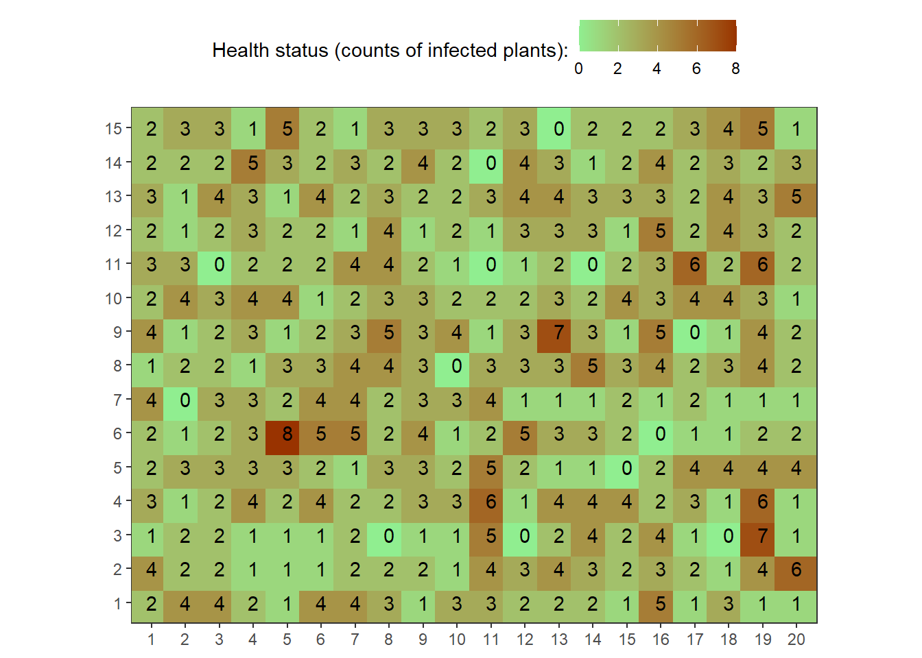
Now, to illustrate the application for sample sizes
Generation of different samples for sample size comparisons
set.seed(500)
field1.sample<-sample(x=field1, size=25)
field1.sample
## [1] 1 3 3 2 2 4 0 4 6 1 3 4 2 3 2 2 4 1 4 4 2 2 3 2 1Calculations for mean, variance, and variance based on binomial distribution
First, let’s calculate disease incidence as a proportion
(field1.sampleB<-field1.sample/10)## [1] 0.1 0.3 0.3 0.2 0.2 0.4 0.0 0.4 0.6 0.1 0.3 0.4 0.2 0.3 0.2 0.2 0.4 0.1 0.4
## [20] 0.4 0.2 0.2 0.3 0.2 0.1(field1.mean<-mean(field1.sampleB))## [1] 0.26(field1.var<-var(field1.sampleB) )#Variance based on normal distribution## [1] 0.01833333(field1.varbin<-(field1.mean*(1-field1.mean))/10)## [1] 0.01924Compare variances = index of dispersion (D); values close to 1 indicate patterns not distinguishable from random; much larger than 1 indicate patterns of aggregation (formal tests exist as this is merely for illustration)
field1.var/field1.varbin## [1] 0.952876Sample size calculations for CV = 0.1 and 0.2, respectively
N1<-(1-field1.mean)/(10*field1.mean*0.1^2)
N1
## [1] 28.46154N2<-(1-field1.mean)/(10*field1.mean*0.2^2)
N2## [1] 7.115385Exercise: Draw a new sample of 25 and run the same calculations to determine new sample sizes based on CV = 0.1 and CV = 0.2
Cluster sampling for disease incidence
This code, when copied and pasted, will duplicate the information needed to replicate the example in the notes pertaining to cluster sampling for disease incidence data:
- Number of quadrants = 300
- Probability of success (i.e., disease) = 0.35
- theta $= overdispersion parameter, which is connected to shape1 and shape2 parameters
Note: this distribution is rather flexible and takes on many different forms depending on the parameters, for our illustration, emphasis will be placed on generating an over-dispersed example to illustrate the calculations. Here, prob=0.35 represent the probability a given plant would be infected, based on Bernoulli trials and subsequently the beta-distribution
set.seed(10000)
field2<-rbetabinom(n=300, prob=0.35, size=10, shape1=0.2, shape2=2)

field2.matrix<-matrix(field2,nrow=15,ncol=20)
field2.matrix
## [,1] [,2] [,3] [,4] [,5] [,6] [,7] [,8] [,9] [,10] [,11] [,12] [,13]
## [1,] 0 1 5 0 2 3 0 1 0 2 0 0 0
## [2,] 0 0 0 0 4 3 0 0 1 0 0 0 0
## [3,] 0 0 0 5 0 2 0 0 0 3 0 3 0
## [4,] 0 0 1 0 0 0 0 0 0 0 0 1 0
## [5,] 0 0 1 0 4 0 0 0 1 0 0 0 0
## [6,] 2 0 0 0 0 0 1 0 0 4 0 0 0
## [7,] 0 0 0 0 0 0 0 0 3 0 0 3 0
## [8,] 1 0 0 0 2 7 0 1 1 0 0 0 0
## [9,] 0 0 0 0 0 0 0 0 0 0 1 0 0
## [10,] 0 0 0 7 3 0 0 0 1 0 0 0 0
## [11,] 0 4 1 4 2 0 0 4 3 4 0 0 0
## [12,] 1 0 0 0 0 1 0 0 0 0 3 0 0
## [13,] 0 0 0 0 1 0 0 0 1 0 0 0 5
## [14,] 7 0 0 0 1 0 0 0 0 0 1 0 0
## [15,] 0 0 0 0 2 0 0 0 2 0 0 0 0
## [,14] [,15] [,16] [,17] [,18] [,19] [,20]
## [1,] 0 3 3 2 0 1 4
## [2,] 0 2 0 2 1 7 0
## [3,] 3 0 0 3 0 4 0
## [4,] 0 3 1 0 0 0 1
## [5,] 0 0 0 0 0 0 0
## [6,] 2 1 0 0 0 4 1
## [7,] 9 2 4 1 0 0 2
## [8,] 3 0 2 0 0 0 0
## [9,] 0 5 0 0 0 0 3
## [10,] 0 0 0 0 5 0 0
## [11,] 4 0 1 0 0 0 0
## [12,] 0 3 3 0 0 0 0
## [13,] 1 0 0 4 1 1 7
## [14,] 0 0 0 0 0 0 0
## [15,] 6 0 1 0 1 0 3map1_long <-
reshape2::melt(field2.matrix, varnames = c("rows", "cols"))
# See first rows onf melted matrix
head(map1_long)## rows cols value
## 1 1 1 0
## 2 2 1 0
## 3 3 1 0
## 4 4 1 0
## 5 5 1 0
## 6 6 1 2point_size <- 11
map1_long %>%
ggplot(aes(factor(cols), factor(rows),
color = value,
label = as.character(value)))+
geom_point(size = point_size, shape = 15)+
geom_text(colour = "black")+
scale_color_gradient("Health status (counts of infected plants):",
low = "lightgreen", high = "#993300")+
theme_bw()+
theme(axis.title = element_blank(),
legend.position = "top",
panel.background = element_rect(terrain.colors(5)[3]),
panel.grid.major = element_blank(), panel.grid.minor = element_blank())+
coord_equal()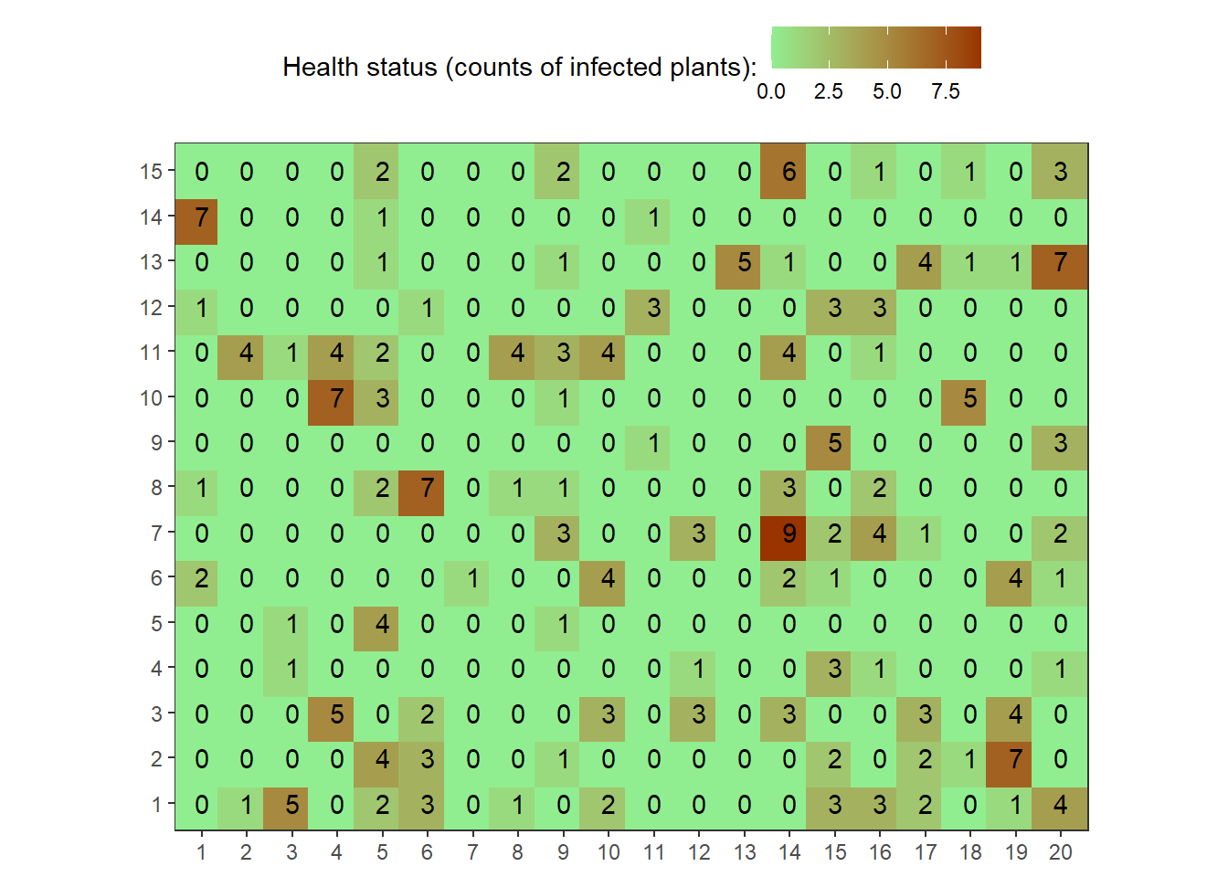
Generate a sample of size 25 that represents the pilot study.
set.seed(602)
field2.sample<-sample(x=field2, size=25)
field2.sample
## [1] 0 0 0 1 0 0 0 4 0 0 1 2 0 0 0 0 0 9 0 0 0 0 0 0 0Calculations for mean, variance, and variance based on binomial distribution
First, let’s calculate disease incidence as a proportion followed by a comparison of the variances
field2.sampleB<-field2.sample/10
field2.mean<-mean(field2.sampleB)
field2.var<-var(field2.sampleB) #Variance based on normal distribution
field2.varbin<-(field2.mean*(1-field2.mean))/10
Index of dispersion (D)
var.relation<-field2.var/field2.varbinQuestion: What does index of dispersion stand for?
N1<-(1-field1.mean)/(10*field1.mean*0.1^2)
N1
## [1] 28.46154N2<-(1-field1.mean)/(10*field1.mean*0.2^2)
N2## [1] 7.115385Exercise: Draw a new sample of 25 and run the same calculations to
determine new sample sizes based on CV = 0.1 and CV = 0.2
Hint: set.seed()
Sample Size Calculations 1
Based on previous knowledge of the Power law relationship, values were calculated to represent to two parameters, A and B (see Madden et al. for more details) Parameters: A=16; B=1.4
N1<-(1-field1.mean)/(10*field1.mean*0.1^2)
N1
## [1] 28.46154N2<-(1-field1.mean)/(10*field1.mean*0.2^2)
N2## [1] 7.115385Define parameters:
A<-16
B<-1.4
CV1 <- .1
CV2 <- .2
Calculate the sample size.
(N.power1<-(A*field2.mean^(B-2)*(1-field2.mean)^B)/(10^B*CV1^2))## [1] 289.5989(N.power2<-(A*field2.mean^(B-2)*(1-field2.mean)^B)/(10^B*CV2^2))## [1] 72.39973Sample Size Calculations 2
Based on design effect (deff) and the beta-binomial distribution calculations. We use here the var.relation to represent the empirical heterogeneity factor (deff)
deff = 2.54
CV1 <- .1
CV2 <- .2

N.betabinom1 <- ((1 - field2.mean) * deff) / (10 * field2.mean * CV1 ^ 2)
N.betabinom2 <- ((1 - field2.mean) * deff) / (10 * field2.mean * CV2 ^ 2)
Based on PROPORTION OF MEAN, H, where M(population size) is NOT defined
SRS.PROPORTION.1 <- function (mean,z,H) {
  Nest<-((1-mean)/mean)*(z/H)^2
  names(Nest)<-"SampleSize"
  return(Nest)
}
gg <-
as.data.frame(expand.grid(
mean = seq(.05, .3, .05),
z = 1.96,
H = seq(.1, .5, .05)
)) %>%
mutate(SampleSize = SRS.PROPORTION.1(mean, z, H)) %>%
ggplot(aes(H, SampleSize, group = mean, color = mean)) +
geom_point(size = .5) +
geom_line() +
scale_color_viridis_c() +
theme_bw()
plotly::ggplotly(gg) Based on PROPORTION OF MEAN, H, where M (population size) is defined
- M = population size
- mean = mean disease incidence
- z = desired value for Z (typically for our needs, 1.96 will suffice)
- H = a proportion of the mean, values from the literature range, empirically, from 0.1 to 0.5
EstNfcf <- function (M,mean,z,H) {
  return(((1-mean)/mean)*(z/H)^2)
}
EstFcf <- function (M,mean,z,H) {
  Nest<-((1-mean)/mean)*(z/H)^2
  finite <-Nest/M
  Nsample <-ifelse(finite>0.1,Nest/(1+(Nest/M)),Nest)
  return(round(Nsample,digits=1))
}
NestM <- function (M,mean,z,H) {
  Nest <-((1-mean)/mean)*(z/H)^2
  finite <-Nest/M
  return(round(finite, digits=2))
}
gg <-
as.data.frame(expand.grid(
mean = seq(.05, .3, .05),
z = 1.96,
H = seq(.1,.5,.05),
M =1000
) ) %>%
mutate(
est_nfcf = EstNfcf(M,mean,z,H),
est_fcf = EstFcf(M,mean,z,H),
nest_m = NestM(M,mean,z,H)
) %>%
mutate("NEST/M" = nest_m ,
"Estimated-FCF" = est_fcf,
"Estimated-NFCF" = est_nfcf) %>%
pivot_longer(cols = c("Estimated-NFCF", "Estimated-FCF", "NEST/M")) %>%
ggplot(aes(H, value, group = mean, color = mean))+
geom_point(size = .5)+
geom_line()+
scale_color_viridis_c()+
facet_wrap(~name, ncol = 1, scales = "free_y")+
theme_bw()+
theme(legend.position = "top")plotly::ggplotly(gg) %>%
plotly::layout(legend = list(orientation = "h", x = 0.4, y = -0.2))Based on Fixed positive number, h, where M IS NOT defined (population size)
h represents the half length of a confidence interval based on a fixed positive number
SRS.PROPORTION.1 <- function (mean,z,h) {
  Nest<-(mean*(1-mean))*(z/h)^2
  names(Nest)<-"SampleSize"
  return(Nest)
}
gg <-
as.data.frame(expand.grid(
mean = seq(.05, .3, .05),
z = 1.96,
h = seq(.1,.5,.05)
) ) %>%
mutate(
SampleSize = SRS.PROPORTION.1(mean,z,h)
) %>%
ggplot(aes(h, SampleSize, group = mean, color = mean))+
geom_point(size = .5)+
geom_line()+
scale_color_viridis_c()+
theme_bw()
plotly::ggplotly(gg) CLUSTER SAMPLING FOR DISEASE INCIDENCE
The following section has functions to calculate sample sizes based on Madden et al. (2007), table 10. Note, for the following, the finite population is not applied; this could be handled using direct calculations. Based on known number of sampling units, etc., or code could be modified accordingly.
Based on CV
- mean = mean disease incidence
- n = number of individuals per sampling unit
- CV = coefficient of variation
- N = number of sampling units (e.g., quadrant) estimated based on outlined criteria
EstNfcf <- function (mean, n, CV, M) {
  return(round((1 - mean) / (n * mean * CV ^ 2), 2))
}
EstFcf <- function (mean, n, CV, M) {
  Nest <- (1 - mean) / (n * mean * CV ^ 2)
  finite <- Nest / M
  Nsample <- ifelse(finite > 0.1, Nest / (1 + (Nest / M)), Nest)
  return(round(Nsample, digits = 1))
}
NestM <- function (mean, n, CV, M) {
  Nest <- (1 - mean) / (n * mean * CV ^ 2)
  finite <- Nest / M
  return(round(finite, digits = 2))
}
gg <-
as.data.frame(expand.grid(
mean =seq(.1, .9, .1),
n = 10,
CV =seq(.05, .3, .01),
M = c(100, 500, 1000)
)) %>%
mutate(
est_nfcf = EstNfcf(mean, n, CV, M),
est_fcf = EstFcf(mean, n, CV, M),
nest_m = NestM(mean, n, CV, M)
) %>%
mutate("NEST/M(X100)" = nest_m *100,
"Estimated-FCF" = est_fcf,
"Estimated-NFCF" = est_nfcf) %>%
pivot_longer(cols = c("Estimated-NFCF", "Estimated-FCF", "NEST/M(X100)")) %>%
ggplot(aes(CV, value, group = mean, color = mean))+
geom_point(size = .5)+
geom_line()+
scale_color_viridis_c()+
facet_grid(M~name)+
theme_bw()+
theme(legend.position = "top")plotly::ggplotly(gg) %>%
plotly::layout(legend = list(orientation = "h", x = 0.4, y = -0.2))Based on proportion of mean, H
- mean = mean disease incidence
- n = number of individuals per sampling unit
- z = desired value for Z (typically for our needs, 1.96 will suffice)
- H = a proportion of the mean, values from the literature range, empirically, from 0.1 to 0.5
CLUSTER.RANDOM.2 <- function (mean, n, z, H) {
  Nest<-((1-mean)/(n*mean))*(z/H)^2
  names(Nest)<-"SampleSize"
  return(Nest)
}
gg <-
as.data.frame(expand.grid(
mean = seq(.05, .3, .05),
n = 10,
z = 1.96,
H = seq(.1, .5, .05)
)) %>%
mutate(SampleSize = CLUSTER.RANDOM.2(mean, n, z, H)) %>%
ggplot(aes(H, SampleSize, group = mean, color = mean)) +
geom_point(size = .5) +
geom_line() +
scale_color_viridis_c() +
theme_bw()
plotly::ggplotly(gg) Based on fixed positive number, H
- mean = mean disease incidence
- n = number of individuals per sampling unit
- z = desired value for Z (typically for our needs, 1.96 will suffice)
- h = half length of the confidence interval
CLUSTER.RANDOM.3 <- function(mean, n, z, h) {
  Nest <- ((mean * (1 - mean)) / n) * (z / h) ^ 2
  names(Nest) <- "SampleSize"
  return(Nest)
}
gg <-
as.data.frame(expand.grid(
mean = seq(.05, .3, .05),
n = 10,
z = 1.96,
h = seq(.01,.1,.01)
) ) %>%
mutate(
SampleSize = CLUSTER.RANDOM.3(mean,n, z,h)
) %>%
ggplot(aes(h, SampleSize, group = mean, color = mean))+
geom_point(size = .5)+
geom_line()+
scale_color_viridis_c()+
theme_bw()
plotly::ggplotly(gg)